
- Services
- Case Studies
- Technologies
- NextJs development
- Flutter development
- NodeJs development
- ReactJs development
- About
- Contact
- Tools
- Blogs
- FAQ
 Scroll to discover
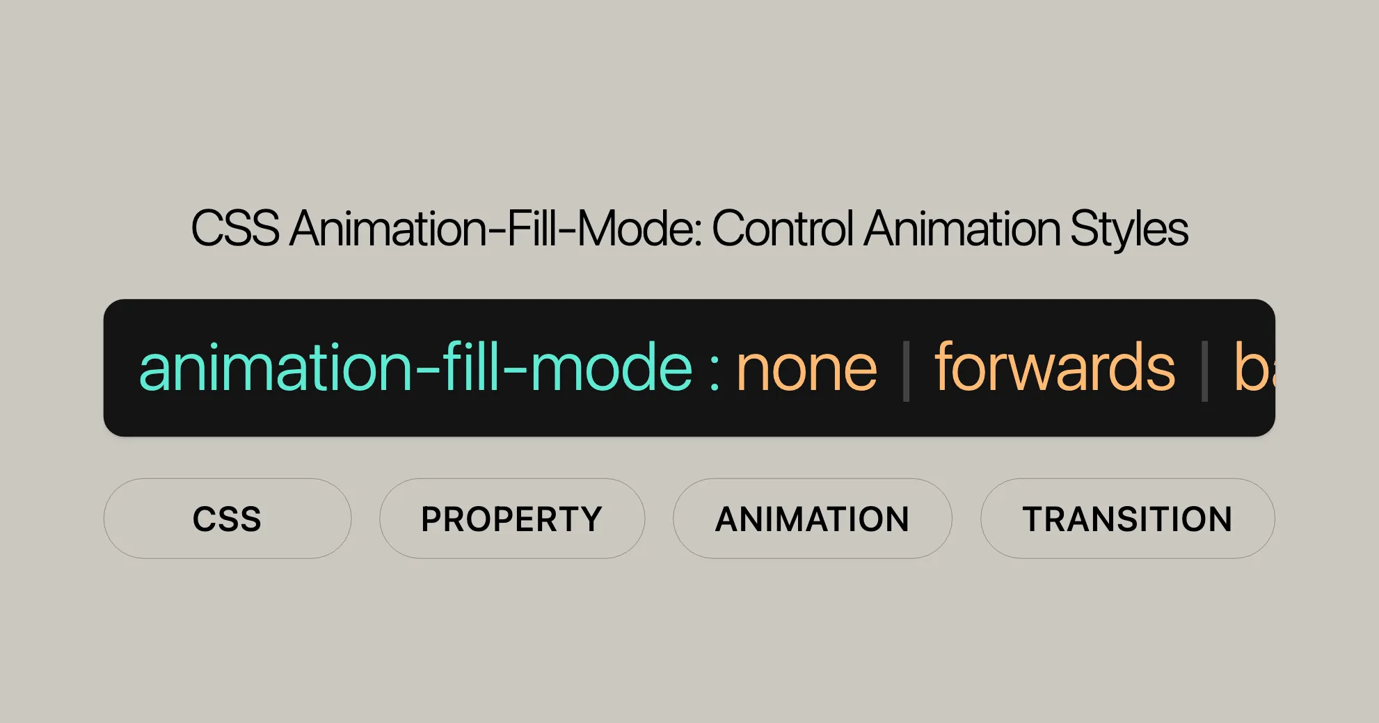
 CSS Animation-Fill-Mode Control Animation Styles
Discover available options like forwards, backwards, both, and more.
Introduction
The animation-fill-mode property in CSS is a powerful tool for controlling how an animation affects an element before and after it runs. By default, CSS animations do not retain any styles from keyframes when the animation isn’t running. However, with animation-fill-mode, you can change this behavior to make your animations more dynamic and engaging.
This property allows you to ensure that an element retains the styles from the last keyframe after the animation ends or applies the initial keyframe styles before the animation starts. This flexibility enhances the user experience by creating smooth transitions and visually appealing animations.
In this article, we’ll explore the syntax, values, and practical examples of the animation-fill-mode property. We’ll also discuss best practices, browser compatibility, and answer frequently asked questions to help you make the most of this essential CSS feature in your web development projects.
Specification
The animation-fill-mode property is part of the CSS Animations Level 1 specification. This standard defines how CSS animations should behave, including how animations apply styles to elements before and after execution. The specification ensures consistent behavior across different web browsers, making it easier for web developers to create animations that work reliably on various platforms.
You can find the detailed specifications for the animation-fill-mode property in the CSS Animations Level 1 documentation. This resource provides comprehensive information on how to use the property effectively and understand its interactions with other CSS animation properties.
Syntax
The animation-fill-mode property in CSS is straightforward to use. It lets you specify how an animation should apply its styles before and after it runs. The syntax for the animation-fill-mode property is as follows:
animation-fill-mode: none | forwards | backwards | both | initial | inherit;Here’s a breakdown of the syntax:
- none: The default value. The animation does not apply any styles to the element before or after it executes.
- forwards: After the animation completes, the element retains the styles from the last keyframe.
- backwards: The element applies the styles from the first keyframe before the animation starts and retains these styles during any delay period.
- both: The animation follows the rules for both
forwardsandbackwards, extending the animation properties in both directions. - initial: Sets the property to its default value.
- inherit: Inherits the property value from its parent element.
You can also specify multiple values for the animation-fill-mode property if you have multiple animations. For example:
animation-fill-mode: none, forwards, backwards;This syntax ensures that each animation is applied according to the specified animation-fill-mode values in the order they appear.
Values
The animation-fill-mode property in CSS offers several values that determine how an animation applies its styles before and after it runs. Understanding these values is crucial for creating effective and visually appealing animations. Here is a detailed explanation of each value:
none
The none value is the default behavior for the animation-fill-mode property. When set to none, the animation does not apply any styles to the target element before or after it executes. The element will instead be displayed using any other CSS rules applied to it.
forwards
The forwards value ensures that the target element retains the computed values set by the last keyframe encountered during the animation’s execution. The last keyframe depends on the values of the animation-direction and animation-iteration-count properties:
animation-direction | animation-iteration-count | Last keyframe encountered |
|---|---|---|
normal | even or odd | 100% or to |
reverse | even or odd | 0% or from |
alternate | even | 0% or from |
alternate | odd | 100% or to |
alternate-reverse | even | 100% or to |
alternate-reverse | odd | 0% or from |
Using forwards ensures that the animated properties retain their final values after the animation ends.
backwards
The backwards value applies the styles defined in the first relevant keyframe as soon as the animation is applied to the target, and it retains these styles during the animation-delay period. The first relevant keyframe depends on the value of the animation-direction property:
animation-direction | First relevant keyframe |
|---|---|
normal or alternate | 0% or from |
reverse or alternate-reverse | 100% or to |
Using backwards allows the animation to start with the initial keyframe styles even before the animation begins.
both
The both value combines the behaviors of forwards and backwards, extending the animation properties in both directions. This means the element will apply the initial keyframe styles before the animation starts and retain the final keyframe styles after the animation ends.
initial
The initial value sets the property to its default value, which is none.
inherit
The inherit value allows the element to inherit the animation-fill-mode property from its parent element.
By understanding and using these values effectively, you can create more dynamic and engaging animations that significantly enhance the user experience on your website.
Examples
Let’s look at some practical examples to see how animation-fill-mode works. These examples will help you understand how different values of animation-fill-mode affect the behavior of your animations.
Using forwards
In this example, we’ll create an animation that grows a box and retains its final size after the animation ends.
HTML:
<p>Move your mouse over the gray box!</p><div class="demo"> <div class="growsandstays">This grows and stays big.</div> <div class="grows">This just grows.</div></div>CSS:
.demo {  border-top: 100px solid #ccc;  height: 300px;}
@keyframes grow {  0% {    font-size: 0;  }  100% {    font-size: 40px;  }}
.demo:hover .grows {  animation-name: grow;  animation-duration: 3s;}
.demo:hover .growsandstays {  animation-name: grow;  animation-duration: 3s;  animation-fill-mode: forwards;}
In this example, when you hover over the .demo container, both .grows and .growsandstays elements will grow. However, the .growsandstays element will retain its final size after the animation ends due to the animation-fill-mode: forwards property.
Using backwards
In this example, we’ll create an animation that applies the initial keyframe styles before the animation starts.
HTML:
<div class="backwards-demo"></div>CSS:
@keyframes move {  from {    margin-left: 0%;    background-color: #aaaaaa;  }  to {    margin-left: 60%;    background-color: #008000;  }}
.backwards-demo {  width: 400px;  height: 50px;  background-color: orange;  animation-name: move;  animation-duration: 3s;  animation-delay: 2s;  animation-fill-mode: backwards;}
In this example, the .backwards-demo element will apply the initial keyframe styles (gray background and starting position) before the animation starts, thanks to the animation-fill-mode: backwards property.
Using both
In this example, we’ll create an animation that applies both the initial keyframe styles before the animation starts and retains the final keyframe styles after the animation ends.
HTML:
<div class="both-demo"></div>CSS:
@keyframes scale {  from {    transform: scale(1);    background-color: #ff0000;  }  to {    transform: scale(2);    background-color: #0000ff;  }}
.both-demo {  width: 100px;  height: 100px;  background-color: yellow;  animation-name: scale;  animation-duration: 3s;  animation-delay: 2s;  animation-fill-mode: both;}
In this example, the .both-demo element will apply the initial keyframe styles (red background and original size) before the animation starts and retain the final keyframe styles (blue background and doubled size) after the animation ends, thanks to the animation-fill-mode: both property.
These examples demonstrate how the animation-fill-mode property can be used to create more dynamic and engaging animations on your website.
Best Practices for Using animation-fill-mode
Here are some tips to help you use animation-fill-mode effectively:
Use Meaningful Animations
- Ensure your animations serve a purpose, such as providing feedback or guiding user interaction.
Consider Performance
- Test animations across devices to ensure they perform smoothly. Use
will-changeto optimize performance.
Enhance User Interaction
- Use animations to improve user interaction, like button feedback.
Maintain Consistency
- Make sure your animations match your site’s design and branding.
Use forwards for Final States
- Use
animation-fill-mode: forwardswhen you want an element to keep its final animation state.
Use backwards for Initial States
- Use
animation-fill-mode: backwardsto apply initial keyframe styles before the animation starts.
Combine both for Complex Animations
- Use
animation-fill-mode: bothfor animations that need initial and final styles.
Avoid Overusing Animations
- Use animations sparingly to avoid overwhelming users.
Test Across Browsers
- Ensure animations work consistently across different browsers.
Optimize for Accessibility
- Consider users with disabilities. Provide options to disable or reduce animations.
Browser Compatibility
animation-fill-mode is widely supported across modern web browsers:
- Google Chrome: Supported since version 43.0 (May 2015).
- Mozilla Firefox: Supported since version 16.0 (October 2012).
- Microsoft Edge: Supported since version 12.0 (August 2015).
- Internet Explorer: Supported since version 10.0 (September 2012).
- Opera: Supported since version 30.0 (June 2015).
- Safari: Supported since version 9.0 (September 2015).
For up-to-date compatibility information, check MDN Web Docs or Can I use.
CSS Animation Resources
- Using CSS animations: A detailed guide on creating and controlling CSS animations with examples and best practices.
- JavaScript
AnimationEventAPI: Learn how to use JavaScript to interact with CSS animations for more dynamic web experiences. - Other Related Animation Properties:
animation: A shorthand property to set all animation properties at once.animation-composition: Defines how animations should be combined when multiple animations are applied to the same element.animation-delay: Specifies the delay before an animation starts.animation-direction: Defines the direction in which an animation should play.animation-duration: Specifies the duration of an animation.animation-iteration-count: Defines the number of times an animation should repeat.animation-name: Specifies the name of the animation.animation-play-state: Controls the play state of an animation (e.g., running or paused).animation-timeline: Defines a timeline for the animation.animation-timing-function: Specifies the speed curve of the animation.
These resources will help you understand CSS animations better and create more engaging web designs.
FAQs
What is the animation-fill-mode property in CSS?
The animation-fill-mode property specifies how a CSS animation should apply styles to its target before and after it runs, determining if the element should retain styles defined in keyframes.
How does animation-fill-mode: forwards work?
With forwards, after the animation ends, the element keeps the styles defined in the last keyframe, instead of reverting to its original styles.
What is the difference between animation-fill-mode: backwards and animation-fill-mode: forwards?
- backwards: Applies the initial keyframe styles during any delay period before the animation starts.
- forwards: Applies the final keyframe styles after the animation finishes.
What is the default value of animation-fill-mode?
The default value is none, meaning the animation does not retain any keyframe styles before or after it runs.
How does animation-fill-mode affect animations with multiple iterations?
For multi-iteration animations, animation-fill-mode: forwards only applies styles from the last keyframe after the last iteration ends. If you have delays between iterations, backwards can be useful for ensuring the element is styled correctly during the delay period.
What is the both value for animation-fill-mode?
The both value combines the behaviors of forwards and backwards, extending the animation properties in both directions. This means the element will apply the initial keyframe styles before the animation starts and retain the final keyframe styles after the animation ends.
How do I ensure browser compatibility for animation-fill-mode?
The animation-fill-mode property is widely supported across modern web browsers. To ensure your animations perform as expected, test them across different browsers. For the most accurate and up-to-date information on browser compatibility, refer to resources like the MDN Web Docs or the Can I use website.
What are some best practices for using animation-fill-mode?
- Use Meaningful Animations: Ensure that your animations serve a purpose and enhance the user experience.
- Consider Performance: Test your animations across different devices to ensure they perform smoothly.
- Enhance User Interaction: Use animations to provide feedback and improve user interaction.
- Maintain Consistency: Ensure that your animations are consistent with your website’s overall design and branding.
- Avoid Overusing Animations: While animations can enhance the user experience, overusing them can be distracting and overwhelming.
- Test Across Browsers: Ensure that your animations work consistently across different web browsers.
- Optimize for Accessibility: Consider users with disabilities when designing animations. Some users may have difficulty with fast or complex animations.
By following these best practices, you can create visually appealing and user-friendly animations that enhance the overall experience of your website.
 Latest Blogs
  สร้างเว็บไซต์ 1 เว็บ ต้องใช้งบเท่าไหร่? เจาะลึกทุกองค์ประกอบ website development cost อยากสร้างเว็บไซต์แต่ไม่มั่นใจในเรื่องของงบประมาณ อ่านสรุปเจาะลึกตั้งแต่ดีไซน์, ฟังก์ชัน และการดูแล พร้อมตัวอย่างงบจริงจาก Till it’s done ที่แผนชัด งบไม่บานปลายแน่นอน
  Next.js สอน 14 ขั้นตอนเบื้องต้น: สร้างโปรเจกต์แรกใน 30 นาที เริ่มต้นกับ Next.js ใน 14 ขั้นตอนเพียงแค่ 30 นาที พร้อม SSR/SSG และ API Routes ด้วยตัวอย่างโค้ดง่าย ๆ อ่านต่อเพื่อสร้างโปรเจ็กต์แรกได้ทันทีที่นี่
  วิธีสมัคร Apple Developer Account เพื่อนำแอปขึ้น App Store ทีละขั้นตอน อยากปล่อยแอปบน App Store ระดับโลก มาอ่านคู่มือสมัคร Apple Developer Account พร้อมเคล็ดลับ TestFlight และวิธีอัปโหลดที่ง่ายในบทความเดียวนี้ได้เลย
  TypeScript Interface คืออะไร? อธิบายพร้อมวิธีใช้และข้อแตกต่างจาก Type เรียนรู้วิธีใช้ TypeScript Interface เพื่อสร้างโครงสร้างข้อมูลที่ปลอดภัยและเข้าใจง่าย พร้อมเปรียบเทียบข้อดีข้อแตกต่างกับ Type ที่คุณต้องรู้ ถูกรวมเอาไว้ในบทความนี้แล้ว
  Material-UI (MUI) คืออะไร อยากสร้าง UI สวยงามและเป็นมืออาชีพในเวลาอันรวดเร็วใช่ไหม มาทำความรู้จักกับ Material-UI (MUI) ที่ช่วยให้คุณพัฒนาแอปพลิเคชันบน React ได้ง่ายและดูดีในทุกอุปกรณ์
  เปรียบเทียบ 3 วิธีติดตั้ง install node js บน Ubuntu: NVM vs NodeSource vs Official Repo แบบไหนดีที่สุด? เรียนรู้วิธีติดตั้ง Node.js บน Ubuntu ด้วย NVM, NodeSource หรือ Official Repo เลือกวิธีที่เหมาะกับความต้องการของคุณ พร้อมเปรียบเทียบ เพื่อการพัฒนาที่มีประสิทธิภาพ!
 พูดคุยกับซีอีโอ
Explore our best articles, cover a wide variety of technologies 
 ReactJs
  Flutter
  Nodejs
  Nextjs
  TailwindCSS
  Typescript Golang AstroJs Jest Website development th Mobile application th Reactjs th Nextjs th Flutter th Software house th Nodejs th Typescript th
  CSS
CSS We'll be right here with you every step of the way.
We'll be here, prepared to commence this promising collaboration.


Whether you're curious about features, warranties, or shopping policies, we provide comprehensive answers to assist you.