
- Services
- Case Studies
- Technologies
- NextJs development
- Flutter development
- NodeJs development
- ReactJs development
- About
- Contact
- Tools
- Blogs
- FAQ
 Scroll to discover
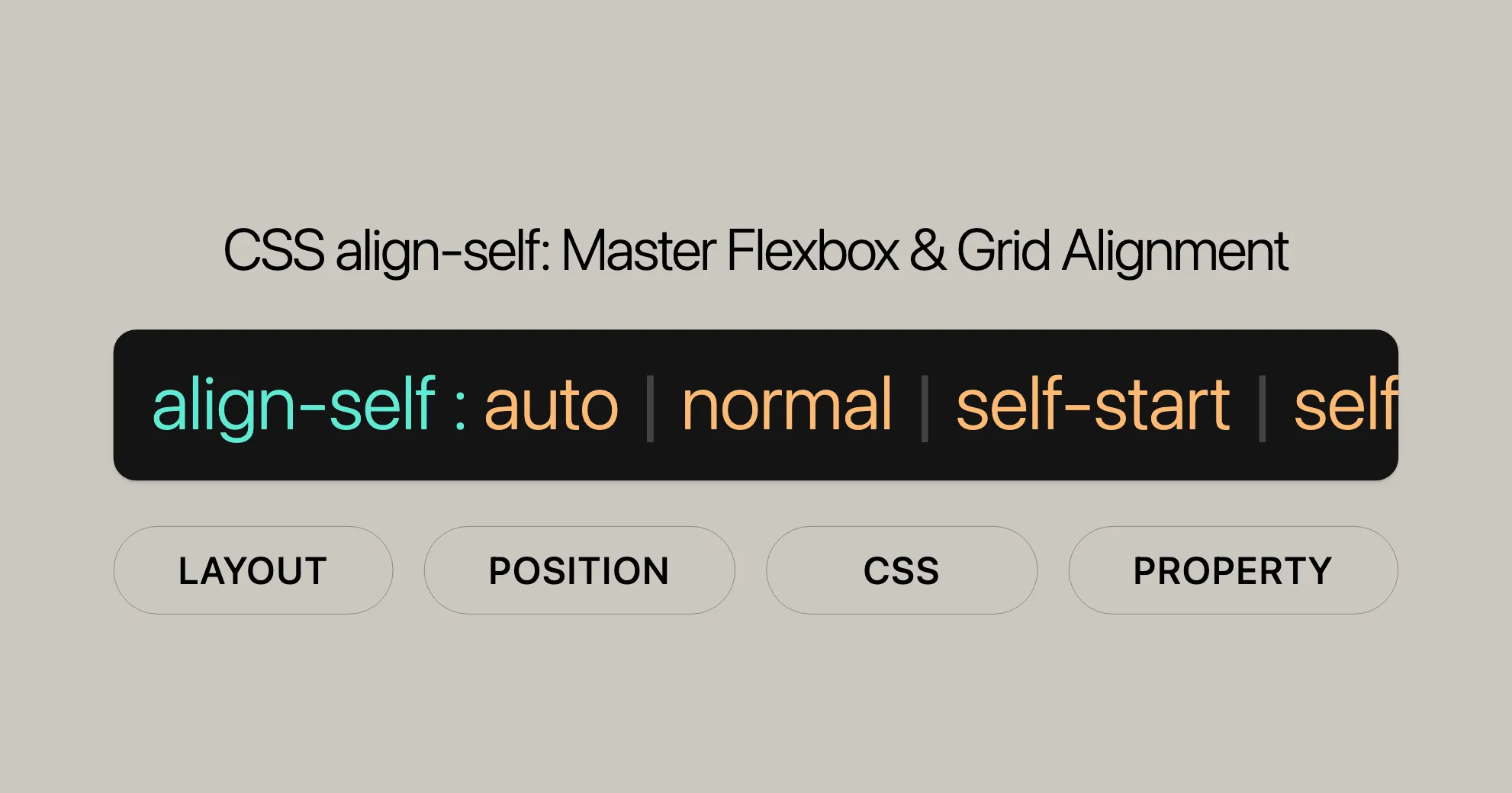
 CSS align-self Master Flexbox & Grid Alignment
Explore available options like auto, center, flex-start, and more.
Introduction to CSS Properties
Learn about various CSS properties and how to use them effectively in your web development projects.
Basic Concepts of Flexbox
Flexbox is a powerful layout model in CSS that allows you to create flexible and responsive designs. Understanding the key concepts and principles of flexbox will help you to create dynamic layouts with ease.
Aligning Items in a Flex Container
Discover how to align items within a flex container using various CSS properties, including align-items and align-self. These properties allow you to control the alignment of items along the cross axis, helping you to create visually appealing and functional layouts.
Box Alignment in CSS Grid Layouts
Explore how to align items within CSS Grid layouts using properties like align-self. This property allows you to achieve precise control over element positioning, ensuring that your designs look great on all devices.
CSS Box Alignment
Dive into the CSS Box Alignment module, which defines alignment properties for flexbox and grid layouts. Understanding these properties will help you to create sophisticated and responsive designs that adapt to different screen sizes and orientations.
The align-items Property
The align-items property sets the default alignment for items within a flex or grid container. It allows you to control the alignment of all items along the cross axis, ensuring that your layouts are consistent and visually appealing.
The align-self Property
The align-self property allows you to override the alignment specified by the container’s align-items property for a specific item. This property is particularly useful for fine-tuning the layout of complex designs.
Examples
Let’s look at some examples to see how these properties work in practice.
HTML Structure
<section> <div>Item #1</div> <div>Item #2</div> <div>Item #3</div></section>CSS Styles
Example 1: Aligning an Item to the Flex End
section {  display: flex;  align-items: center; /* Default alignment */  height: 120px;  background: beige;}
div {  height: 60px;  background: cyan;  margin: 5px;}
div:nth-child(3) {  align-self: flex-end; /* Align third item to the flex end */  background: pink;}
Example 2: Aligning an Item to the Center
section {  display: flex;  align-items: center; /* Default alignment */  height: 120px;  background: beige;}
div {  height: 60px;  background: cyan;  margin: 5px;}
div:nth-child(2) {  align-self: center; /* Center the second item */  background: pink;}
Example 3: Stretching an Item
section {  display: flex;  align-items: center; /* Default alignment */  height: 120px;  background: beige;}
div {  height: 60px;  background: cyan;  margin: 5px;}
div:nth-child(1) {  align-self: stretch; /* Stretch the first item */  background: pink;}
Interactive Example
To see the align-self property in action, you can use this interactive example. Click the buttons to change the alignment of the second item:
<!DOCTYPE html><html><head>    <title>CSS align-self Property</title>    <style>        .flex-box {            background-color: #776fac;            padding: 5px;            height: 500px;            display: flex;            flex-wrap: wrap;            align-items: flex-start;        }
        .flex-box > div {            background-color: aliceblue;            margin: 5px;            width: 100px;            height: 80px;            line-height: 80px;            text-align: center;            font-size: 18px;        }
        .buttons {            margin-top: 20px;        }
        .buttons button {            margin-right: 10px;            padding: 5px 10px;            font-size: 16px;        }    </style></head><body>    <div class="flex-box">        <div>1</div>        <div id="align-item">2</div>        <div>3</div>        <div>4</div>        <div>5</div>        <div>6</div>        <div>7</div>        <div>8</div>        <div>9</div>    </div>
    <div class="buttons">        <button onclick="alignItem('auto')">auto</button>        <button onclick="alignItem('stretch')">stretch</button>        <button onclick="alignItem('center')">center</button>        <button onclick="alignItem('flex-start')">flex-start</button>        <button onclick="alignItem('flex-end')">flex-end</button>        <button onclick="alignItem('baseline')">baseline</button>        <button onclick="alignItem('initial')">initial</button>        <button onclick="alignItem('inherit')">inherit</button>    </div>
    <script>        function alignItem(value) {            document.getElementById('align-item').style.alignSelf = value;        }    </script></body></html>
Browser Compatibility
The align-self property is widely supported across modern browsers, ensuring that you can use it confidently in your web development projects.
Desktop Browsers
- Google Chrome: Supported from version 21.0.
- Mozilla Firefox: Supported from version 20.0.
- Microsoft Edge: Supported from version 11.0.
- Opera: Supported from version 12.1.
- Safari: Supported from version 9.0.
Mobile/Tablet Browsers
- Android Chrome: Supported from version 128.
- Android Firefox: Supported from version 127.
- Android WebView: Supported from version 4.4.
- iOS Safari: Supported from version 7.0-7.1.
Ensuring Cross-Browser Compatibility
- Use Feature Detection: Implement feature detection to check if a browser supports
align-self. - Test Across Devices: Ensure that your layouts are tested on both desktop and mobile devices.
- Stay Updated: Keep your browser versions updated for the latest features.
Additional Resources
For more detailed information on browser compatibility, you can refer to resources like Can I Use and the official documentation provided by browser vendors.
FAQs
What is the align-self property in CSS?
The align-self property in CSS allows you to override the alignment specified by the container’s align-items property for a specific item. It is used to align a single flex or grid item along the cross-axis, providing precise control over the positioning of individual elements within a container.
How does align-self work in a flexbox layout?
In a flexbox layout, align-self is applied to individual flex items and aligns them independently of the container’s align-items value. It adjusts the item’s position along the cross-axis (vertical in a row layout, horizontal in a column layout). This property is particularly useful for fine-tuning the layout of complex designs.
How is align-self different from align-items?
align-items is applied to the entire container, affecting all items, while align-self is applied to individual items, allowing you to control the alignment of a single item within a container. This makes align-self a more granular tool for customizing layouts.
How does align-self work in a grid layout?
In a grid layout, align-self allows grid items to override the grid container’s align-items value, controlling how an individual grid item is aligned within its grid area along the cross-axis. This is useful for creating intricate grid designs where different items need to be aligned differently.
What is the default value of align-self?
The default value of align-self is auto, which means the item inherits the value of the container’s align-items property. If the parent does not have an align-items value, the default is stretch.
Can align-self be used on block-level elements?
No, the align-self property does not apply to block-level boxes or table cells. It is specifically designed for use with flex items and grid items.
What happens if a flexbox item’s cross-axis margin is set to auto?
If a flexbox item’s cross-axis margin is set to auto, the align-self property will be ignored. The item’s position will be determined by the margin settings instead.
How can I center an item within a flex container using align-self?
To center an item within a flex container using align-self, you can set the align-self value to center. This will position the item at the center of the container along the cross-axis.
Can align-self be used to stretch an item to fit the container?
Yes, you can use the stretch value with align-self to make an item stretch to fit the container along the cross-axis, respecting max-height and max-width constraints.
What is the safe value in align-self?
The safe value in align-self ensures that if the item overflows the container, it is aligned as if the alignment mode were start. This helps prevent content from being cut off or hidden.
What is the unsafe value in align-self?
The unsafe value in align-self honors the given alignment value regardless of the relative sizes of the item and the container. This can be useful for precise control but should be used carefully to avoid overflow issues.
By understanding these FAQs, you can effectively utilize the align-self property to create precise and customized layouts in your web development projects.
 Latest Blogs
  สร้างเว็บไซต์ 1 เว็บ ต้องใช้งบเท่าไหร่? เจาะลึกทุกองค์ประกอบ website development cost อยากสร้างเว็บไซต์แต่ไม่มั่นใจในเรื่องของงบประมาณ อ่านสรุปเจาะลึกตั้งแต่ดีไซน์, ฟังก์ชัน และการดูแล พร้อมตัวอย่างงบจริงจาก Till it’s done ที่แผนชัด งบไม่บานปลายแน่นอน
  Next.js สอน 14 ขั้นตอนเบื้องต้น: สร้างโปรเจกต์แรกใน 30 นาที เริ่มต้นกับ Next.js ใน 14 ขั้นตอนเพียงแค่ 30 นาที พร้อม SSR/SSG และ API Routes ด้วยตัวอย่างโค้ดง่าย ๆ อ่านต่อเพื่อสร้างโปรเจ็กต์แรกได้ทันทีที่นี่
  วิธีสมัคร Apple Developer Account เพื่อนำแอปขึ้น App Store ทีละขั้นตอน อยากปล่อยแอปบน App Store ระดับโลก มาอ่านคู่มือสมัคร Apple Developer Account พร้อมเคล็ดลับ TestFlight และวิธีอัปโหลดที่ง่ายในบทความเดียวนี้ได้เลย
  TypeScript Interface คืออะไร? อธิบายพร้อมวิธีใช้และข้อแตกต่างจาก Type เรียนรู้วิธีใช้ TypeScript Interface เพื่อสร้างโครงสร้างข้อมูลที่ปลอดภัยและเข้าใจง่าย พร้อมเปรียบเทียบข้อดีข้อแตกต่างกับ Type ที่คุณต้องรู้ ถูกรวมเอาไว้ในบทความนี้แล้ว
  Material-UI (MUI) คืออะไร อยากสร้าง UI สวยงามและเป็นมืออาชีพในเวลาอันรวดเร็วใช่ไหม มาทำความรู้จักกับ Material-UI (MUI) ที่ช่วยให้คุณพัฒนาแอปพลิเคชันบน React ได้ง่ายและดูดีในทุกอุปกรณ์
  เปรียบเทียบ 3 วิธีติดตั้ง install node js บน Ubuntu: NVM vs NodeSource vs Official Repo แบบไหนดีที่สุด? เรียนรู้วิธีติดตั้ง Node.js บน Ubuntu ด้วย NVM, NodeSource หรือ Official Repo เลือกวิธีที่เหมาะกับความต้องการของคุณ พร้อมเปรียบเทียบ เพื่อการพัฒนาที่มีประสิทธิภาพ!
 พูดคุยกับซีอีโอ
Explore our best articles, cover a wide variety of technologies 
 ReactJs
  Flutter
  Nodejs
  Nextjs
  TailwindCSS
  Typescript Golang AstroJs Jest Website development th Mobile application th Reactjs th Nextjs th Flutter th Software house th Nodejs th Typescript th
  CSS
CSS We'll be right here with you every step of the way.
We'll be here, prepared to commence this promising collaboration.


Whether you're curious about features, warranties, or shopping policies, we provide comprehensive answers to assist you.