
- Services
- Case Studies
- Technologies
- NextJs development
- Flutter development
- NodeJs development
- ReactJs development
- About
- Contact
- Tools
- Blogs
- FAQ
 Scroll to discover
 CSS Accent-Color Enhance Web Design with Custom Colors
Available options include auto, color values, and global values.
Introduction
The accent-color CSS property lets you customize the accent color of various user interface elements, enhancing the visual appeal and consistency of your web designs. This property can be applied to elements like checkboxes, radio buttons, range inputs, and progress bars to ensure a harmonious user experience.
This guide will walk you through the essentials of the accent-color property, including its limited availability, supported HTML elements, syntax, values, examples, specifications, browser compatibility, and related resources. Whether you’re a seasoned developer or just starting out, understanding accent-color can significantly improve the look and feel of your projects.
Limited Availability
Note that the accent-color property is not yet widely supported across all browsers. As of now, it’s a non-baseline feature, meaning it may not work in some widely-used browsers. Be aware of these limitations when using it in your projects.
For more details on compatibility and to provide feedback, check out these resources:
Description
The accent-color property sets the accent color for user interface controls, allowing you to override the default colors provided by the browser. This gives you greater control over the appearance of elements like checkboxes, radio buttons, range inputs, and progress bars, ensuring a cohesive and visually appealing design.
Supported HTML Elements
The accent-color property currently supports the following HTML elements:
<input type="checkbox"><input type="radio"><input type="range"><progress>
Each browser has its own default accent color for these elements. The accent-color property is only applied to controls that utilize an accent color.
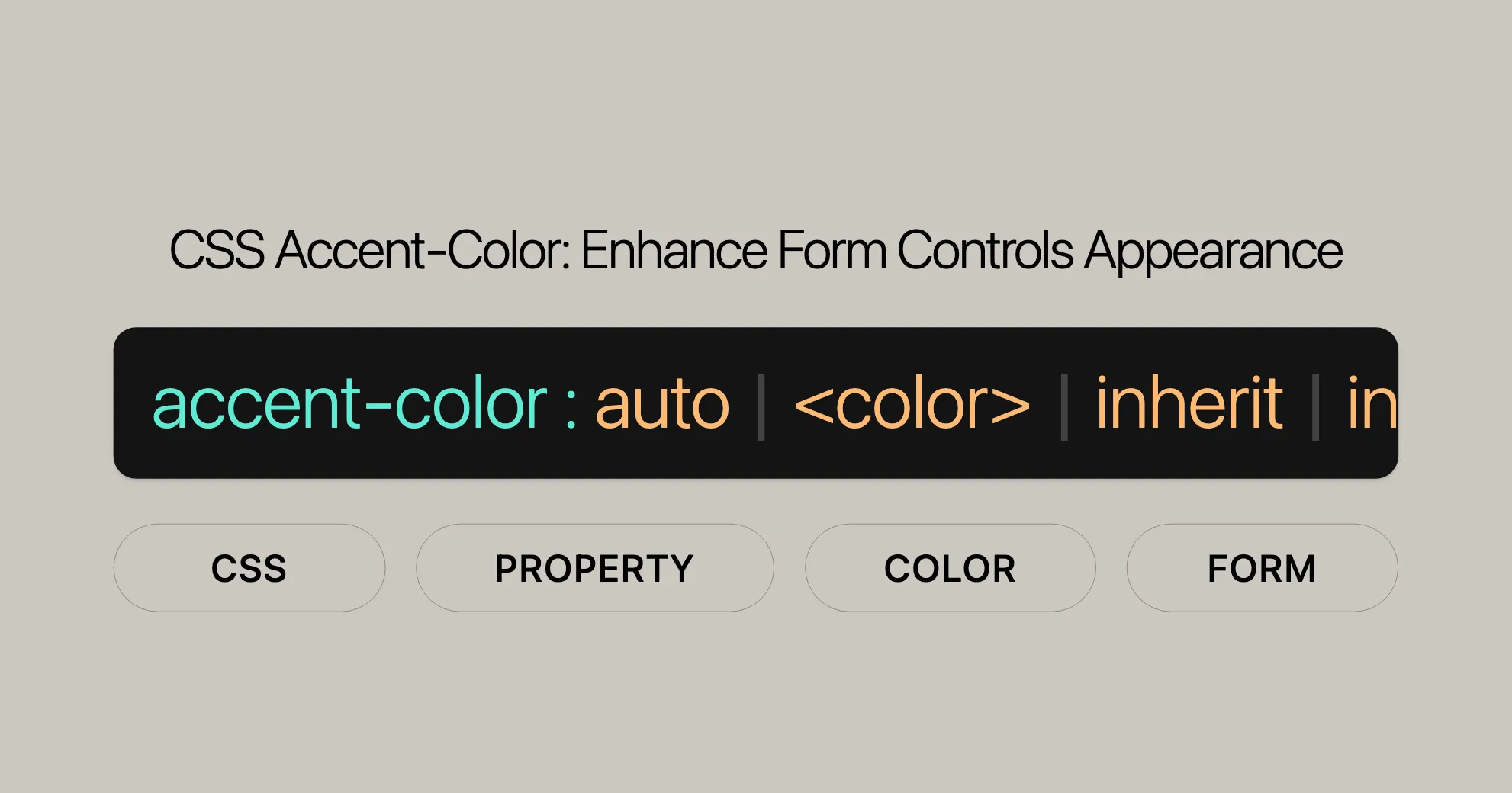
Syntax and Values
The syntax for the accent-color property is straightforward. Here’s how to use it:
/* Keyword values */accent-color: auto;
/* <color> values */accent-color: darkred;accent-color: #5729e9;accent-color: rgb(0 200 0);accent-color: hsl(228 4% 24%);
/* Global values */accent-color: inherit;accent-color: initial;accent-color: revert;accent-color: revert-layer;accent-color: unset;
Values:
auto: Uses the user agent’s default color.<color>: Specifies a custom color using names, hex codes, RGB, or HSL values.- Global values: Inherit from parent, reset to initial, etc.
Formal Definition
| Property | Value |
|---|---|
| Initial value | auto |
| Applies to | all elements |
| Inherited | yes |
| Computed value | auto is computed as specified, and <color> values are computed as defined for the color property. |
| Animation type | by computed value type |
Examples
Setting a Custom Accent Color
HTML:
<input type="checkbox" checked /><input type="checkbox" class="custom" checked />CSS:
input {  accent-color: auto;  display: block;  width: 30px;  height: 30px;}
input.custom {  accent-color: rebeccapurple;}
In this example, the first checkbox uses the default accent color, while the second checkbox has a custom accent color set to rebeccapurple.
Customizing Multiple Elements
HTML:
<input type="checkbox" checked /><input type="checkbox" class="custom" checked /><input type="radio" name="group" /><input type="radio" name="group" class="custom" /><input type="range" /><input type="range" class="custom" /><progress value="50" max="100"></progress><progress value="50" max="100" class="custom"></progress>CSS:
input, progress {  accent-color: auto;  display: block;  margin: 10px 0;}
.custom {  accent-color: hotpink;}
Using accent-color with Global Values
HTML:
<div class="parent"> <input type="checkbox" checked /> <input type="checkbox" class="child" checked /></div>CSS:
.parent {  accent-color: blue;}
.child {  accent-color: inherit;}
Specifications
The accent-color property is defined in the CSS Basic User Interface Module Level 4 under the widget-accent section. This specification is currently in the Working Draft stage.
Browser Compatibility
To check the compatibility of the accent-color property and provide feedback, refer to the following resources:
See Also
For further reading and related resources, explore the following topics:
background-color,border-color,caret-color,color,column-rule-color,outline-color,text-decoration-color,text-emphasis-color,text-shadow: Other color-related properties<color>: Related data type<input>: Related HTML element
Understanding the accent-color property and its applications can enhance the visual appeal and user experience of your web designs.
Browser Compatibility
Desktop Browsers
- Google Chrome: Supported since version 93.
- Firefox: Supported since version 92.
- Safari: Supported since version 15.4.
- Opera: Supported since version 79.
- Edge: Supported since version 93.
Mobile Browsers
- iOS Safari: Supported since version 15.4.
- Android Chrome: Supported since version 104.
- Android Firefox: Supported since version 101.
- Android Browser: Supported since version 104.
- Opera Mobile: Not supported.
Additional Notes
While accent-color can enhance your web designs, be aware of its limited browser support. Always test across different browsers and devices for a consistent user experience.
For the latest updates, visit MDN Web Docs.
By understanding and using the accent-color property, you can create visually appealing and user-friendly web designs.
 Latest Blogs
  สร้างเว็บไซต์ 1 เว็บ ต้องใช้งบเท่าไหร่? เจาะลึกทุกองค์ประกอบ website development cost อยากสร้างเว็บไซต์แต่ไม่มั่นใจในเรื่องของงบประมาณ อ่านสรุปเจาะลึกตั้งแต่ดีไซน์, ฟังก์ชัน และการดูแล พร้อมตัวอย่างงบจริงจาก Till it’s done ที่แผนชัด งบไม่บานปลายแน่นอน
  Next.js สอน 14 ขั้นตอนเบื้องต้น: สร้างโปรเจกต์แรกใน 30 นาที เริ่มต้นกับ Next.js ใน 14 ขั้นตอนเพียงแค่ 30 นาที พร้อม SSR/SSG และ API Routes ด้วยตัวอย่างโค้ดง่าย ๆ อ่านต่อเพื่อสร้างโปรเจ็กต์แรกได้ทันทีที่นี่
  วิธีสมัคร Apple Developer Account เพื่อนำแอปขึ้น App Store ทีละขั้นตอน อยากปล่อยแอปบน App Store ระดับโลก มาอ่านคู่มือสมัคร Apple Developer Account พร้อมเคล็ดลับ TestFlight และวิธีอัปโหลดที่ง่ายในบทความเดียวนี้ได้เลย
  TypeScript Interface คืออะไร? อธิบายพร้อมวิธีใช้และข้อแตกต่างจาก Type เรียนรู้วิธีใช้ TypeScript Interface เพื่อสร้างโครงสร้างข้อมูลที่ปลอดภัยและเข้าใจง่าย พร้อมเปรียบเทียบข้อดีข้อแตกต่างกับ Type ที่คุณต้องรู้ ถูกรวมเอาไว้ในบทความนี้แล้ว
  Material-UI (MUI) คืออะไร อยากสร้าง UI สวยงามและเป็นมืออาชีพในเวลาอันรวดเร็วใช่ไหม มาทำความรู้จักกับ Material-UI (MUI) ที่ช่วยให้คุณพัฒนาแอปพลิเคชันบน React ได้ง่ายและดูดีในทุกอุปกรณ์
  เปรียบเทียบ 3 วิธีติดตั้ง install node js บน Ubuntu: NVM vs NodeSource vs Official Repo แบบไหนดีที่สุด? เรียนรู้วิธีติดตั้ง Node.js บน Ubuntu ด้วย NVM, NodeSource หรือ Official Repo เลือกวิธีที่เหมาะกับความต้องการของคุณ พร้อมเปรียบเทียบ เพื่อการพัฒนาที่มีประสิทธิภาพ!
 พูดคุยกับซีอีโอ
Explore our best articles, cover a wide variety of technologies 
 ReactJs
  Flutter
  Nodejs
  Nextjs
  TailwindCSS
  Typescript Golang AstroJs Jest Website development th Mobile application th Reactjs th Nextjs th Flutter th Software house th Nodejs th Typescript th
  CSS
CSS We'll be right here with you every step of the way.
We'll be here, prepared to commence this promising collaboration.


Whether you're curious about features, warranties, or shopping policies, we provide comprehensive answers to assist you.