
- Services
- Case Studies
- Technologies
- NextJs development
- Flutter development
- NodeJs development
- ReactJs development
- About
- Contact
- Tools
- Blogs
- FAQ
 Scroll to discover
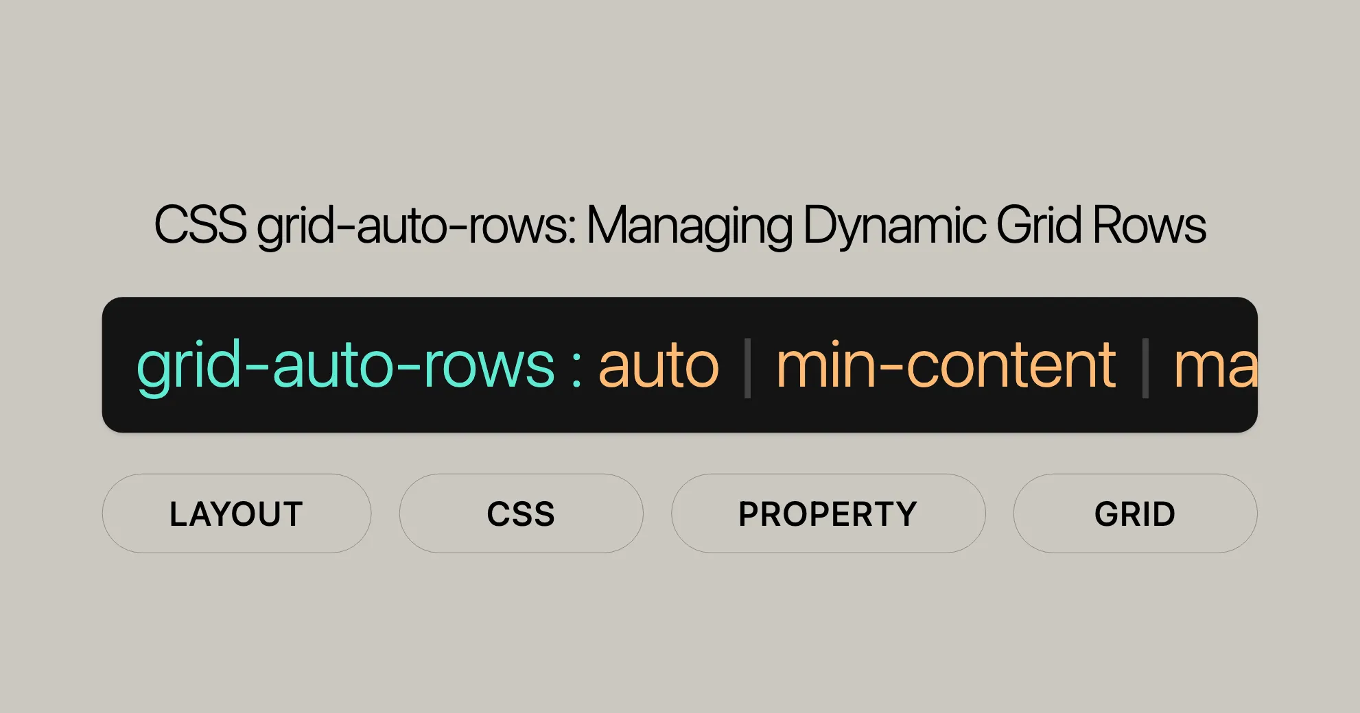
 CSS grid-auto-rows Managing Dynamic Grid Rows
Learn about fixed, flexible, minmax, and inherit options for responsive layouts.
Introduction
The grid-auto-rows property in CSS is a handy tool for web developers. It lets you set the size of automatically created grid rows, making it easier to manage dynamic content and create flexible layouts. This feature has been widely available since July 2020 and works across many devices and browsers. Whether you’re an experienced developer or just starting out, understanding grid-auto-rows can help you design more responsive web pages.
In this guide, we’ll dive into the grid-auto-rows property. You’ll learn about its syntax, values, and how to use it effectively in your CSS grid layouts. We’ll also provide practical examples to help you master this essential CSS property and improve your web development skills.
By the end of this guide, you’ll have a solid understanding of grid-auto-rows and how it can be used to create impressive and efficient web designs. Let’s get started!
Specification
The grid-auto-rows property is part of the CSS Grid Layout Module Level 2. It controls the sizing of rows that aren’t explicitly defined in your grid template, providing a flexible way to manage dynamic content.
This property is well-supported across modern browsers, making it a reliable tool for web developers. It ensures your grid layouts adapt smoothly to various content sizes and types, enhancing the overall user experience.
Description
The grid-auto-rows property in CSS defines the size of automatically created grid rows. When your grid layout has items that go beyond the explicitly defined rows, grid-auto-rows handles the sizing of these additional rows. This is particularly useful for dynamic content that can expand beyond the initial grid template.
Using grid-auto-rows, you can specify the height of these implicit rows in various ways, such as fixed lengths, percentages, or flexible units like fr. This flexibility allows you to create responsive and adaptable grid layouts that can handle different types of content seamlessly.
Syntax
The grid-auto-rows property specifies the size of implicitly created grid rows. The syntax is straightforward and supports various values:
grid-auto-rows: [ <track-size> ]+;Syntax Breakdown
<track-size>: Represents the size of the implicitly created grid row. It can be defined using:- Keyword values:
min-content,max-content,auto - Length values:
100px,20cm,50vmax - Percentage values:
10%,33.3% - Flex values:
0.5fr,3fr - Minmax values:
minmax(100px, auto),minmax(max-content, 2fr),minmax(20%, 80vmax) - Fit-content values:
fit-content(400px),fit-content(5cm),fit-content(20%) - Multiple track-size values: You can specify multiple track sizes separated by spaces.
- Keyword values:
Example Syntax
/* Keyword values */grid-auto-rows: min-content;grid-auto-rows: max-content;grid-auto-rows: auto;
/* Length values */grid-auto-rows: 100px;grid-auto-rows: 20cm;grid-auto-rows: 50vmax;
/* Percentage values */grid-auto-rows: 10%;grid-auto-rows: 33.3%;
/* Flex values */grid-auto-rows: 0.5fr;grid-auto-rows: 3fr;
/* Minmax values */grid-auto-rows: minmax(100px, auto);grid-auto-rows: minmax(max-content, 2fr);grid-auto-rows: minmax(20%, 80vmax);
/* Fit-content values */grid-auto-rows: fit-content(400px);grid-auto-rows: fit-content(5cm);grid-auto-rows: fit-content(20%);
/* Multiple track-size values */grid-auto-rows: min-content max-content auto;grid-auto-rows: 100px 150px 390px;grid-auto-rows: 10% 33.3%;grid-auto-rows: 0.5fr 3fr 1fr;grid-auto-rows: minmax(100px, auto) minmax(max-content, 2fr) minmax(20%, 80vmax);grid-auto-rows: 100px minmax(100px, auto) 10% 0.5fr fit-content(400px);
Global Values
In addition to the specific track sizes, grid-auto-rows also supports global values:
grid-auto-rows: inherit;grid-auto-rows: initial;grid-auto-rows: revert;grid-auto-rows: revert-layer;grid-auto-rows: unset;Values
The grid-auto-rows property supports a wide range of values, each offering different ways to control the size of implicitly created grid rows.
Length Values
Length values specify a fixed size for the grid rows.
grid-auto-rows: 100px;grid-auto-rows: 20cm;grid-auto-rows: 50vmax;Percentage Values
Percentage values specify the size of the grid rows as a percentage of the grid container’s block size.
grid-auto-rows: 10%;grid-auto-rows: 33.3%;Flex Values
Flex values use the fr unit to specify the flex factor of the grid rows.
grid-auto-rows: 0.5fr;grid-auto-rows: 3fr;Max-Content
The max-content keyword represents the largest maximal content contribution of the grid items occupying the grid track.
grid-auto-rows: max-content;Min-Content
The min-content keyword represents the largest minimal content contribution of the grid items occupying the grid track.
grid-auto-rows: min-content;Minmax(min, max)
The minmax() functional notation defines a size range greater than or equal to min and less than or equal to max.
grid-auto-rows: minmax(100px, auto);grid-auto-rows: minmax(max-content, 2fr);grid-auto-rows: minmax(20%, 80vmax);Fit-Content(length | percentage)
The fit-content() functional notation represents the formula min(max-content, max(auto, argument)).
grid-auto-rows: fit-content(400px);grid-auto-rows: fit-content(5cm);grid-auto-rows: fit-content(20%);Auto
The auto keyword represents the range between the minimum and maximum sizes of the items in that track.
grid-auto-rows: auto;Global Values
The grid-auto-rows property also supports several global values:
grid-auto-rows: inherit;grid-auto-rows: initial;grid-auto-rows: revert;grid-auto-rows: revert-layer;grid-auto-rows: unset;Multiple Track-Size Values
You can specify multiple track sizes to create a repeating pattern of row sizes.
grid-auto-rows: min-content max-content auto;grid-auto-rows: 100px 150px 390px;grid-auto-rows: 10% 33.3%;grid-auto-rows: 0.5fr 3fr 1fr;grid-auto-rows: minmax(100px, auto) minmax(max-content, 2fr) minmax(20%, 80vmax);grid-auto-rows: 100px minmax(100px, auto) 10% 0.5fr fit-content(400px);Formal Definition
The grid-auto-rows property in CSS is formally defined to specify the size of implicitly created grid rows. It is part of the CSS Grid Layout Module Level 2.
Initial Value
- Initial Value:
auto
Applies to
- Applies to: Grid containers
Inherited
- Inherited: No
Percentages
- Percentages: Refer to the corresponding dimension of the content area
Computed Value
- Computed Value: The percentage as specified or the absolute length
Animation Type
- Animation Type: By computed value type
Formal Syntax
grid-auto-rows = <track-size>[+]<track-size> = <track-breadth> | minmax( <inflexible-breadth> , <track-breadth> ) | fit-content( <length-percentage [0,∞]> )<track-breadth> = <length-percentage [0,∞]> | <flex [0,∞]> | min-content | max-content | auto<inflexible-breadth> = <length-percentage [0,∞]> | min-content | max-content | auto<length-percentage> = <length> | <percentage>Explanation
<track-size>: Represents the size of the implicitly created grid row track.<track-breadth>: Represents the breadth of the track.<inflexible-breadth>: Represents the inflexible breadth of the track.<length-percentage>: Represents a length or percentage value.
By understanding the grid-auto-rows property, you can create dynamic and responsive grid layouts that adapt to various content sizes and types, enhancing the overall design and functionality of your web pages.
Examples
Setting Grid Row Size
Using grid-auto-rows: auto
HTML
<div id="grid"> <div id="item1">1</div> <div id="item2">2</div> <div id="item3">3</div></div>CSS
#grid {  display: grid;  grid-template-columns: repeat(2, 1fr);  gap: 20px;  grid-auto-rows: auto;}
#grid > div {  background-color: lime;  display: flex;  justify-content: center;  align-items: center;  font-size: 18px;}
Using grid-auto-rows: length
HTML
<div id="grid"> <div id="item1">1</div> <div id="item2">2</div> <div id="item3">3</div></div>CSS
#grid {  display: grid;  grid-template-columns: repeat(2, 1fr);  gap: 20px;  grid-auto-rows: 150px;}
#grid > div {  background-color: lime;  display: flex;  justify-content: center;  align-items: center;  font-size: 18px;}
Using grid-auto-rows: minmax(min, max)
HTML
<div id="grid"> <div id="item1">1</div> <div id="item2">2</div> <div id="item3">3</div></div>CSS
#grid {  display: grid;  grid-template-columns: repeat(2, 1fr);  gap: 20px;  grid-auto-rows: minmax(100px, 3.5cm);}
#grid > div {  background-color: lime;  display: flex;  justify-content: center;  align-items: center;  font-size: 18px;}
Using grid-auto-rows: initial
HTML
<div id="grid"> <div id="item1">1</div> <div id="item2">2</div> <div id="item3">3</div></div>CSS
#grid {  display: grid;  grid-template-columns: repeat(2, 1fr);  gap: 20px;  grid-auto-rows: initial;}
#grid > div {  background-color: lime;  display: flex;  justify-content: center;  align-items: center;  font-size: 18px;}
Using grid-auto-rows: inherit
HTML
<div class="container"> <div id="grid"> <div id="item1">1</div> <div id="item2">2</div> <div id="item3">3</div> </div></div>CSS
.container {  grid-auto-rows: 80px;}
#grid {  display: grid;  grid-template-columns: repeat(2, 1fr);  gap: 20px;  grid-auto-rows: inherit;}
#grid > div {  background-color: lime;  display: flex;  justify-content: center;  align-items: center;  font-size: 18px;}
Supported Browsers
The grid-auto-rows property is supported by the following browsers:
- Google Chrome 57
- Microsoft Edge 16
- Mozilla Firefox 52
- Safari 10
- Opera 44
FAQs
What does the grid-auto-rows property control in CSS?
The grid-auto-rows property sets the size of rows that are automatically created when content overflows the defined grid layout.
How can I set a fixed height for auto-generated rows?
You can set a fixed height using: grid-auto-rows: 150px; which ensures every new row is 150px tall.
What is the impact of setting grid-auto-rows to auto?
Setting grid-auto-rows to auto adjusts the row height based on the content it contains, allowing for flexible row heights.
Can I use grid-auto-rows with minmax()?
Yes, using minmax() with grid-auto-rows allows you to set a minimum and maximum height for the automatically generated rows, e.g., grid-auto-rows: minmax(100px, auto);.
When is grid-auto-rows particularly useful?
Grid-auto-rows is ideal for layouts with dynamic content where the number of rows isn’t predetermined, such as image galleries or content streams that expand as more items are added.
Can grid-auto-rows be used with percentage values?
Yes, you can use percentage values with grid-auto-rows. For example, grid-auto-rows: 20%; sets the height of each row to 20% of the grid container’s height.
How does the grid-auto-rows property interact with the align-content and justify-content properties?
Grid-auto-rows can be stretched by the align-content and justify-content properties. By default, an auto sized track will take up any remaining space in the grid container, making the layout flexible and adaptable.
Can I reset the grid-auto-rows property to its default value?
Yes, you can reset grid-auto-rows to its default value using initial. For example, grid-auto-rows: initial; resets the property to auto, ensuring the height of the rows is determined automatically based on the content.
How do I ensure consistency in row heights across nested grids?
Use the inherit value with grid-auto-rows to ensure that the implicitly created rows in a nested grid inherit the row height from the parent grid container. For example, grid-auto-rows: inherit; ensures the nested grid’s row height is the same as the parent grid.
By understanding these tips, you’ll be able to use the grid-auto-rows property effectively in your CSS grid layouts, making your designs dynamic and responsive.
 Latest Blogs
  สร้างเว็บไซต์ 1 เว็บ ต้องใช้งบเท่าไหร่? เจาะลึกทุกองค์ประกอบ website development cost อยากสร้างเว็บไซต์แต่ไม่มั่นใจในเรื่องของงบประมาณ อ่านสรุปเจาะลึกตั้งแต่ดีไซน์, ฟังก์ชัน และการดูแล พร้อมตัวอย่างงบจริงจาก Till it’s done ที่แผนชัด งบไม่บานปลายแน่นอน
  Next.js สอน 14 ขั้นตอนเบื้องต้น: สร้างโปรเจกต์แรกใน 30 นาที เริ่มต้นกับ Next.js ใน 14 ขั้นตอนเพียงแค่ 30 นาที พร้อม SSR/SSG และ API Routes ด้วยตัวอย่างโค้ดง่าย ๆ อ่านต่อเพื่อสร้างโปรเจ็กต์แรกได้ทันทีที่นี่
  วิธีสมัคร Apple Developer Account เพื่อนำแอปขึ้น App Store ทีละขั้นตอน อยากปล่อยแอปบน App Store ระดับโลก มาอ่านคู่มือสมัคร Apple Developer Account พร้อมเคล็ดลับ TestFlight และวิธีอัปโหลดที่ง่ายในบทความเดียวนี้ได้เลย
  TypeScript Interface คืออะไร? อธิบายพร้อมวิธีใช้และข้อแตกต่างจาก Type เรียนรู้วิธีใช้ TypeScript Interface เพื่อสร้างโครงสร้างข้อมูลที่ปลอดภัยและเข้าใจง่าย พร้อมเปรียบเทียบข้อดีข้อแตกต่างกับ Type ที่คุณต้องรู้ ถูกรวมเอาไว้ในบทความนี้แล้ว
  Material-UI (MUI) คืออะไร อยากสร้าง UI สวยงามและเป็นมืออาชีพในเวลาอันรวดเร็วใช่ไหม มาทำความรู้จักกับ Material-UI (MUI) ที่ช่วยให้คุณพัฒนาแอปพลิเคชันบน React ได้ง่ายและดูดีในทุกอุปกรณ์
  เปรียบเทียบ 3 วิธีติดตั้ง install node js บน Ubuntu: NVM vs NodeSource vs Official Repo แบบไหนดีที่สุด? เรียนรู้วิธีติดตั้ง Node.js บน Ubuntu ด้วย NVM, NodeSource หรือ Official Repo เลือกวิธีที่เหมาะกับความต้องการของคุณ พร้อมเปรียบเทียบ เพื่อการพัฒนาที่มีประสิทธิภาพ!
 Talk with CEO
Explore our best articles, cover a wide variety of technologies 
 ReactJs
  Flutter
  Nodejs
  Nextjs
  TailwindCSS
  Typescript Golang AstroJs Jest Website development th Mobile application th Reactjs th Nextjs th Flutter th Software house th Nodejs th Typescript th
  CSS
CSS We'll be right here with you every step of the way.
We'll be here, prepared to commence this promising collaboration.


Whether you're curious about features, warranties, or shopping policies, we provide comprehensive answers to assist you.