
- Services
- Case Studies
- Technologies
- NextJs development
- Flutter development
- NodeJs development
- ReactJs development
- About
- Contact
- Tools
- Blogs
- FAQ
 Scroll to discover
 CSS Border-Radius Master Rounded Corners
Discover use cases, options like length, percentage, initial, and inherit.
Enhance your web designs with this versatile property.
Introduction
The CSS border-radius property is a fantastic tool for web developers and designers. It allows you to round the corners of an element’s outer border, making your designs look smooth and professional. You can control each corner individually or all at once, offering great flexibility.
Description
The CSS border-radius property helps you round the corners of an element’s border. You can create circular or elliptical corners by setting different radii. This property applies to the entire background of the element, even if there is no border.
Note:
- Doesn’t work with table elements when
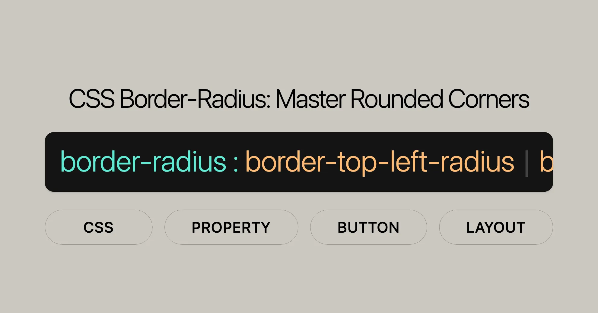
border-collapseis set tocollapse. - Shorthand for
border-top-left-radius,border-top-right-radius,border-bottom-right-radius, andborder-bottom-left-radius.
Syntax
The border-radius property in CSS is used to round the corners of an element’s border. Here’s the basic structure:
border-radius: [1-4 length|%] / [1-4 length|%] | initial | inherit;Parameters
[1-4 length|%]: Specify one to four values.- One value: Applies to all corners.
- Two values: First value for top-left and bottom-right, second value for top-right and bottom-left.
- Three values: First for top-left, second for top-right and bottom-left, third for bottom-right.
- Four values: Apply to top-left, top-right, bottom-right, and bottom-left, respectively.
/: Optional slash to specify additional radii for elliptical corners.initial: Resets to default value.inherit: Inherits from the parent element.
Examples
- Single Value:
border-radius: 10px;
- Two Values:
border-radius: 10px 5%;
- Three Values:
border-radius: 2px 4px 2px;
- Four Values:
border-radius: 1px 0 3px 4px;
- Elliptical Corners:
border-radius: 10px / 20px;
Values
The border-radius property allows various values for precise control:
Length
- Description: Uses units like
px,em, orrem. - Example:
border-radius: 10px;
Percentage (%)
- Description: Relative to the element’s size.
- Example:
border-radius: 50%;
Initial
- Description: Resets to default value.
- Example:
border-radius: initial;
Inherit
- Description: Inherits from the parent element.
- Example:
border-radius: inherit;
Shorthand Notations
You can use shorthand notations to specify different radii for each corner:
- All Corners:
border-radius: value;
- Two Values:
border-radius: value1 value2;
- Three Values:
border-radius: value1 value2 value3;
- Four Values:
border-radius: value1 value2 value3 value4;
Elliptical Corners
Specify elliptical corners using a slash (/):
- Single Elliptical Value:
border-radius: 10px / 20px;
- Two Elliptical Values:
border-radius: 10px 5% / 20px 30px;
Examples
Example 1: Rounded Corners for All Sides
<!DOCTYPE html><html><head> <title>Rounded Corners</title> <style> .box { border-radius: 35px; background: #009900; padding: 30px; text-align: center; width: 300px; height: 120px; } </style></head><body> <div class="box"> <h2>Website</h2> <p>border-radius: 35px;</p> </div></body></html>Example 2: Rounded Corners with Two Values
<!DOCTYPE html><html><head> <title>Rounded Corners</title> <style> .box { border-radius: 20px 40px; background: #009900; padding: 30px; text-align: center; width: 300px; height: 120px; } </style></head><body> <div class="box"> <h2>Website</h2> <p>border-radius: 20px 40px;</p> </div></body></html>Example 3: Rounded Top-Left Corner
<!DOCTYPE html><html><head> <title>Rounded Corners</title> <style> .box { border-top-left-radius: 35px; background: #009900; padding: 30px; text-align: center; width: 300px; height: 120px; } </style></head><body> <div class="box"> <h2>Website</h2> <p>border-top-left-radius: 35px;</p> </div></body></html>Example 4: Elliptical Shape
<!DOCTYPE html><html><head> <title>Elliptical Shape</title> <style> .box { border-radius: 10px / 20px; background: #009900; padding: 30px; text-align: center; width: 300px; height: 120px; } </style></head><body> <div class="box"> <h2>Website</h2> <p>border-radius: 10px / 20px;</p> </div></body></html>Example 5: Circular Shape
<!DOCTYPE html><html><head> <title>Circular Shape</title> <style> .box { border-radius: 50%; background: #009900; padding: 30px; text-align: center; width: 100px; height: 100px; } </style></head><body> <div class="box"> <h2>Website</h2> <p>border-radius: 50%;</p> </div></body></html>Example 6: Rounded Top Corners
<!DOCTYPE html><html><head> <title>Rounded Top Corners</title> <style> .box { border-radius: 10px 10px 0 0; background: #009900; padding: 30px; text-align: center; width: 300px; height: 120px; } </style></head><body> <div class="box"> <h2>Website</h2> <p>border-radius: 10px 10px 0 0;</p> </div></body></html>Example 7: Rounded Bottom Corners
<!DOCTYPE html><html><head> <title>Rounded Bottom Corners</title> <style> .box { border-radius: 0 0 10px 10px; background: #009900; padding: 30px; text-align: center; width: 300px; height: 120px; } </style></head><body> <div class="box"> <h2>Website</h2> <p>border-radius: 0 0 10px 10px;</p> </div></body></html>Browser Compatibility
The border-radius property is widely supported across all major web browsers, making it an essential tool for modern web design and development. Here’s a breakdown of when support for border-radius was introduced in each browser:
- Google Chrome: Supported since version 5.0 (May 2010)
- Firefox: Supported since version 4.0 (March 2011)
- Internet Explorer/Edge: Supported since version 9.0 (March 2011)
- Opera: Supported since version 10.5 (June 2010)
- Safari: Supported since version 5.0 (June 2010)
Related Properties
The border-radius property is part of a larger set of CSS properties that control the appearance and behavior of borders in web design. Understanding these related properties can help you achieve more precise and complex designs. Here are some of the key related properties:
1. border-top-left-radius
- Description: This property specifically controls the radius of the top-left corner of an element.
- Syntax:
border-top-left-radius: [length|%] [length|%];
- Example:
border-top-left-radius: 10px 20px;
2. border-top-right-radius
- Description: This property specifically controls the radius of the top-right corner of an element.
- Syntax:
border-top-right-radius: [length|%] [length|%];
- Example:
border-top-right-radius: 10px 20px;
3. border-bottom-right-radius
- Description: This property specifically controls the radius of the bottom-right corner of an element.
- Syntax:
border-bottom-right-radius: [length|%] [length|%];
- Example:
border-bottom-right-radius: 10px 20px;
4. border-bottom-left-radius
- Description: This property specifically controls the radius of the bottom-left corner of an element.
- Syntax:
border-bottom-left-radius: [length|%] [length|%];
- Example:
border-bottom-left-radius: 10px 20px;
5. border-start-start-radius
- Description: This property controls the radius of the starting corner of the element based on the writing direction and text orientation.
- Syntax:
border-start-start-radius: [length|%] [length|%];
- Example:
border-start-start-radius: 10px 20px;
6. border-start-end-radius
- Description: This property controls the radius of the ending corner of the element based on the writing direction and text orientation.
- Syntax:
border-start-end-radius: [length|%] [length|%];
- Example:
border-start-end-radius: 10px 20px;
7. border-end-start-radius
- Description: This property controls the radius of the starting corner of the element based on the opposite writing direction and text orientation.
- Syntax:
border-end-start-radius: [length|%] [length|%];
- Example:
border-end-start-radius: 10px 20px;
8. border-end-end-radius
- Description: This property controls the radius of the ending corner of the element based on the opposite writing direction and text orientation.
- Syntax:
border-end-end-radius: [length|%] [length|%];
- Example:
border-end-end-radius: 10px 20px;
9. background-clip
- Description: This property determines whether the background extends into the border or not. It can affect the appearance of
border-radius. - Syntax:
background-clip: border-box | padding-box | content-box;
- Example:
background-clip: padding-box;
10. border-collapse
- Description: This property is used to collapse the borders of table elements. It affects how the
border-radiusproperty is applied to table elements. - Syntax:
border-collapse: collapse | separate;
- Example:
border-collapse: collapse;
By understanding and utilizing these related properties, you can gain more precise control over the appearance and behavior of borders in your web designs. This allows you to create more complex and visually appealing designs that enhance the user experience.
 Latest Blogs
  สร้างเว็บไซต์ 1 เว็บ ต้องใช้งบเท่าไหร่? เจาะลึกทุกองค์ประกอบ website development cost อยากสร้างเว็บไซต์แต่ไม่มั่นใจในเรื่องของงบประมาณ อ่านสรุปเจาะลึกตั้งแต่ดีไซน์, ฟังก์ชัน และการดูแล พร้อมตัวอย่างงบจริงจาก Till it’s done ที่แผนชัด งบไม่บานปลายแน่นอน
  Next.js สอน 14 ขั้นตอนเบื้องต้น: สร้างโปรเจกต์แรกใน 30 นาที เริ่มต้นกับ Next.js ใน 14 ขั้นตอนเพียงแค่ 30 นาที พร้อม SSR/SSG และ API Routes ด้วยตัวอย่างโค้ดง่าย ๆ อ่านต่อเพื่อสร้างโปรเจ็กต์แรกได้ทันทีที่นี่
  วิธีสมัคร Apple Developer Account เพื่อนำแอปขึ้น App Store ทีละขั้นตอน อยากปล่อยแอปบน App Store ระดับโลก มาอ่านคู่มือสมัคร Apple Developer Account พร้อมเคล็ดลับ TestFlight และวิธีอัปโหลดที่ง่ายในบทความเดียวนี้ได้เลย
  TypeScript Interface คืออะไร? อธิบายพร้อมวิธีใช้และข้อแตกต่างจาก Type เรียนรู้วิธีใช้ TypeScript Interface เพื่อสร้างโครงสร้างข้อมูลที่ปลอดภัยและเข้าใจง่าย พร้อมเปรียบเทียบข้อดีข้อแตกต่างกับ Type ที่คุณต้องรู้ ถูกรวมเอาไว้ในบทความนี้แล้ว
  Material-UI (MUI) คืออะไร อยากสร้าง UI สวยงามและเป็นมืออาชีพในเวลาอันรวดเร็วใช่ไหม มาทำความรู้จักกับ Material-UI (MUI) ที่ช่วยให้คุณพัฒนาแอปพลิเคชันบน React ได้ง่ายและดูดีในทุกอุปกรณ์
  เปรียบเทียบ 3 วิธีติดตั้ง install node js บน Ubuntu: NVM vs NodeSource vs Official Repo แบบไหนดีที่สุด? เรียนรู้วิธีติดตั้ง Node.js บน Ubuntu ด้วย NVM, NodeSource หรือ Official Repo เลือกวิธีที่เหมาะกับความต้องการของคุณ พร้อมเปรียบเทียบ เพื่อการพัฒนาที่มีประสิทธิภาพ!
 Talk with CEO
Explore our best articles, cover a wide variety of technologies 
 ReactJs
  Flutter
  Nodejs
  Nextjs
  TailwindCSS
  Typescript Golang AstroJs Jest Website development th Mobile application th Reactjs th Nextjs th Flutter th Software house th Nodejs th Typescript th
  CSS
CSS We'll be right here with you every step of the way.
We'll be here, prepared to commence this promising collaboration.


Whether you're curious about features, warranties, or shopping policies, we provide comprehensive answers to assist you.